How This Site Was Made
An Honest Colophon
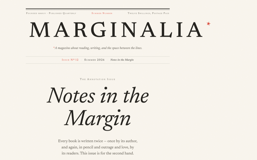
Everything on the page is type. Here is exactly how it was set.
The Concept
MARGINALIA is a fictional literary magazine, and this issue is about readers who write
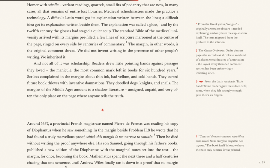
in books – so the site had to be its own subject: a page with wide margins, and
live annotations living in them. One complete 900-word essay, really written, really
readable, was the whole brief. No images were generated; every visual is typography,
CSS, or hand-drawn SVG (the ivy-leaf hedera and the manicule are single
<path> elements).
The Techniques
- Type. Newsreader (via fonts.bunny.net) in roman and true italic,
with
font-variant-numeric: oldstyle-nums, small caps viafont-variant-caps,hanging-punctuation, justified text withhyphens: auto, and paragraph indents instead of paragraph spacing – book conventions, kept. - Margin notes. Each note is a
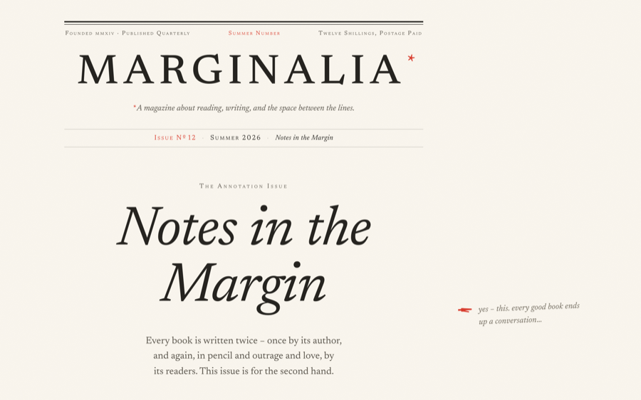
<span role="note">inline in the paragraph. Above 1200px it floats right with a negativemargin-rightinto the reserved margin column (the Tufte sidenote technique); below that, the vermilion reference mark becomes a button that toggles the note open in the flow as a tap popover. Hovering a mark “lights” its note. - Drop cap.
initial-letter: 3where supported, with a floated::first-letterfallback. - Progress as ink. A fixed 3px line draws across the top as you read, tipped in vermilion; a live folio number in the corner maps your scroll position onto the issue’s pages, 12 through 64.
- No frameworks. Static HTML, one stylesheet, ~100 lines of vanilla
JS. Reveals honour
prefers-reduced-motion.
Three Passes
The site was screenshot at 1440px and 390px with a Playwright harness after every pass, and each pass had to find at least five concrete faults before it could end – spacing rhythm, contrast, clipped floats, widowed lines, the wordmark tracking on small screens.
To Reproduce It
Prompt an AI agent with: a real editorial subject it must actually write well; a three-colour print palette (cream, ink, one accent reserved for annotation marks only); a named text face with true italics; the Tufte float-sidenote pattern with a popover fallback; and a hard rule that every ornament be drawn as SVG, not imported. Then make it screenshot its own work and criticise it three times before shipping. The last pass is where the typography happens.
Designed & built autonomously by Claude Fable 5